Are You Ready for Material Design?
Web Developer
Burns360
Material design. It’s a relatively new concept Google defines as a “visual language for users that combines classic design principles with the innovation and possibility of technology.”
If that definition went in one ear and out the other, try this. Material design is a design concept that encourages visitors to a website to subconsciously take action or move on to the next step, which could include making a purchase or signing up for something.
I want to briefly explain this emerging, but somewhat complicated trend, and the importance of determining whether it’s right for you. Choosing a design style begins with considering several factors based on your business goals. Let’s start with three important elements that drive the need and demand for material design.
- Devices: Smartphones, computers, tablets, and smartwatches all allow users to click through, interact with, and make decisions on a website. Material design is geared to be optimal for digital devices. You wouldn’t use material design on a magazine.
- Users: Strong material design considers the experience users will have whenever they click through a website. Ideally, the interaction should be easy and natural. The user shouldn’t spend too much time learning how to use the website. So, strong material design takes this into consideration, and imitates natural physics and movements in a way the user is already familiar with.
- Brand: Since material design is a product of Google, using too many of its principles can make a brand look like another Google product. Is this a good thing?Not necessarily. For instance, material design uses shadows to create depth. If a company already has established shadows in its branding, then it runs the risk of confusing the user if these shadows are treated differently than they are in a material design format.
You’ll get a clearer picture of how all of these elements come into play when you see material design in action. Here is an example.

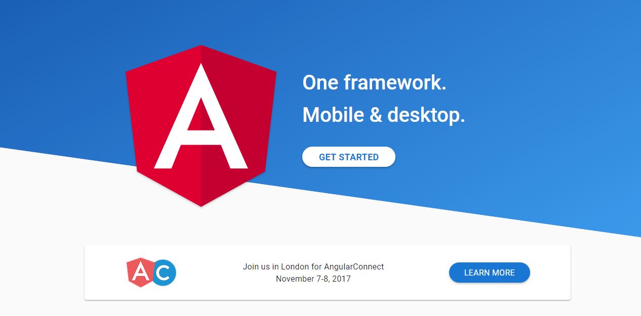
This is the landing page for AngularConnect, a two-day conference for programmers who specialize in the use of a type of Javascript framework.
You’re probably asking, “Where are the examples of material design?” Think to yourself what on this landing page sticks out to you and makes you want to move forward. Hint: There are three.
The “Get Started” and “Learn More” buttons, as well as the bottom bar are all examples of material design. Through the use of shadows and bold color contrasts, all of these have a prominent look to them that tells the user there is an opportunity to take action.
The designer of this landing page clearly considered the devices visitors will use because the design works easily with a tablet, phone, computer screen, etc. User experience is also an important element because the design is simple and easy to interact with. Finally, notice how the page incorporates material design without looking too much like a Google site. AngularConnect doesn’t stray from its own branding.
Now An Important Question…
If you have made it this far, chances are you’re considering whether material design is the right way to go. The number one thing to ask yourself is this. Does your site simply need to share information, or do you need visitors to take action, like making a purchase, placing an order, or anything else proactive.
Simply put, if action is necessary, there is a good chance material design can help your website truly pop.
Have questions? Would you like to incorporate a fresh design on to your site? Let’s talk.


