Google Data Studio Shines a New (and Clearer) Light on Digital Marketing Data
Digital Marketing Manager
Burns360
I recently received an email from Google promoting their newest product, Google Data Studio. As soon as I saw the word “Data Visualization” in bold letters, I immediately thought of the following all-too-common boardroom scenario.
“So as you can see on this Excel spreadsheet, your website ad impressions increased by 13.3% this month, and your conversion rate went up by 1.7%. If you compare it to your best-performing month so far this year, along with where you are on your current sales cycles, the data shows a significant improvement in the effectiveness of your overall digital marketing strategy.”
“Okay, that’s great. But I didn’t get any of that.”
You didn’t? Well, guess what? You’re not alone.
In fast-paced environments, decision-makers are typically saddled with, well—a lot of decisions. And unfortunately, top-level managers don’t always have the luxury to dive into rows of data sheets to interpret what the numbers mean from their perspective.
If you’re the one who is actually preparing the digital marketing reports, the challenge is also similar—you have to convey what seems to be an exorbitant amount of information in a meaningful format. You’d love to get into the nuance of what a number represents, but you know you’ll only have your audience’s attention for a fraction of the time it took you to create the report.
As a digital marketer, I’ve found myself faced with both types of challenges. That’s where a product like Google Data Studio comes in handy.
I won’t explain in full detail what Data Studio is—Google does a far better job explaining the details than I can. But, what I will say is that Data Studio is something every marketer and decision maker should consider, and that it’s well worth your time to do so.
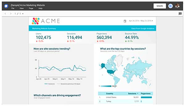
At its core, Google Data Studio has a straightforward function. It collects the data from Google Analytics, Adwords and other products, and turns it into “beautiful, informative reports” (Google does a good job patting itself on the back here). Think of it as a semi-automated Excel sheet. The data is live and self-populating. All you have to do is ask what you’re looking for and how you’d like to see it.

Want to know how many of your sessions came from paid search AND how much it cost to acquire your paid traffic? You can set Data Studio to generate a customized report that clearly shows just that. You spend less time digging and preparing, and more time adjusting your spend and optimizing keywords to help you perform even better the next go-around.

But most importantly, these illustrations aren’t just pretty pictures. They convey meaningful trends that answer the one question every top manager always wants to know. “Did we do better today than we did yesterday?”
Maybe you just did.


